
Juan Miller
I enjoy designing systems that make everyday work simpler, more efficient, and easier to scale.
This portfolio features three projects that reflect how I approach problem-solving—from streamlining freight invoice workflows, to building financial infrastructure for a growing hospitality team, to developing an event check-in app that supports a vibrant local community.
About Me
I’m a self-taught builder with a background in operations, finance, and data systems—but more than anything, I enjoy helping people make sense of complexity. Whether it’s connecting scattered spreadsheets into a real-time dashboard or designing tools that reduce friction in everyday workflows, I thrive at the intersection of business and technology. Over the years, I’ve built systems that help teams move faster, scale with clarity, and deliver better experiences. From growing a property management company, to supporting local community events, to advising other entrepreneurs.I’m also a dad, a mountain biker, and a huge believer in community-driven work. At the core of everything I build is the goal of making things approachable, useful, and human.
My Work
I’m often brought in when systems don’t exist yet or when existing ones are slowing teams down. Over time, I’ve taught myself whatever tools were needed, whether it was SQL, Power BI, Supabase, or no-code platforms, because the priority was always solving the problem in front of me. The case studies here show different sides of that: creating financial systems for a growing short-term rental business, building a community event app from scratch, and designing reporting tools that helped technical and non-technical teams align. I approach each project with curiosity, patience, and a focus on making things practical and easy to use.

From Manual Chaos to Insightful Automation: Optimizing Invoice Workflows at Uber Freight
At Uber Freight, I was brought on as a Senior AP Specialist with SQL experience to support the invoice reconciliation process in a system that had no user interface—only direct database access. What started as a data entry role quickly evolved into a systems overhaul when I realized how much could be improved.
My Role
Senior AP Specialist
Tools: Microsoft SQL Server, Excel (Power Query, VBA), Power BI
Focus: Workflow optimization, RPA error tracking, reporting automation, stakeholder enablement
Challenge
The RPA system was built to automate invoice processing, but errors were common: misread carrier names, incorrect totals, or unreadable documents. The existing workflow involved running pre-written SQL queries, pasting results into Excel, and manually editing error logs—creating delays, version control issues, and inconsistent outcomes.Meanwhile, a massive change log table existed in the database, logging every field-level update across invoices—but no one was using it to identify systemic issues.
Approach
Rewired the entire invoice correction workflow by connecting Excel directly to SQL Server, removing the need for copy-paste
Used Power Query + VBA + Power Automate to create an intuitive interface in Excel with dropdowns and pre-filled query logic so anyone on the team could apply corrections consistently
Discovered the change log table, which logged every column-level change with timestamps, users, and before/after values
Realized that repeated changes to specific fields (e.g., carrier name) indicated recurring RPA failures—even though the table didn’t explicitly track “error types”
Built a Power BI dashboard that surfaced these patterns and visualized trending fields, user actions, and system-wide error hotspots
Collaborated with the DBA to analyze query performance, implement early filtering, and use a reporting view to reduce load times from several minutes to under 30 seconds
Results
The improvements made a meaningful difference in how the AP team worked day to day. By simplifying the invoice correction process, we reduced manual effort and helped the team operate more efficiently with fewer errors. The reporting dashboard gave the RPA developers a clearer view of recurring issues, making it easier for them to identify patterns and adjust their automation logic. While these tools weren’t overly complex, they helped surface the right information at the right time, and contributed to smoother collaboration between operations and finance. The project also reinforced the value of having accessible, well-structured data to support better decisions and future growth.
Key Skills Shown
SQL workflow optimization
Power BI data modeling and visualization
Root cause analysis using indirect data signals
Cross-functional collaboration
Self-starting process redesign without formal direction
What I Learned
This project taught me that powerful systems often already exist—but need translation, structure, and simplification to unlock their value. By stepping back and asking better questions, I was able to turn hidden data into meaningful insights, reduce waste, and help both the business and engineering sides work more effectively.

Building Financial and Operational Infrastructure at StayNWA
At StayNWA, I joined as the first employee and scaled the company’s financial and operational systems from scratch—growing it into one of Northwest Arkansas’ most trusted short-term rental management companies.
My Role
Director of Operations
Tools: BigQuery, Looker Studio, Google Sheets, Forms, Guesty API
Responsibilities: Financial systems, owner reporting, data modeling, automation, vendor management
Challenge
The company was growing rapidly but had no backend systems in place to support property-level financial tracking, vendor payments, or owner transparency. All operational, booking, and expense data existed in inconsistent formats—often across separate tools, spreadsheets, and email threads.This created major friction:
• Inaccurate or delayed owner payouts
• Difficult reconciliation of expenses across 50+ properties
• No dashboards or visibility for performance or restocking
Approach
Built the entire reporting stack using Google Workspace tools and BigQuery
Pulled reservation and revenue data via Guesty API, then cleaned and structured it into a centralized database
Created standardized Google Forms to capture vendor payments, restocking logs, and manual charges with dropdowns and validations
Designed Looker Studio dashboards for both internal use and owner-specific reporting
Built automated logic to calculate net payouts, expense breakdowns, and forecasted revenue
Documented all systems in Google Sheets + Coda for handoff and scaling
Results
The systems I built at StayNWA helped the team scale more confidently and sustainably as the number of managed properties grew from 5 to over 50. By automating parts of the financial reporting and standardizing how expenses and revenues were tracked, we reduced a lot of the manual work that was slowing things down. It also gave property owners more transparency and trust in the process, since they could see accurate, consistent reporting each month. These systems weren’t overly polished at first, but they got the job done, and as the company grew, they provided a solid foundation we could keep improving. I also uncovered a few financial inconsistencies that had gone unnoticed—like tax miscalculations and undercharging for restocking—which helped tighten up operations and improve overall accuracy.
Key Skills Shown
Systems design from scratch
Operational scaling
Financial modeling
API-driven data pipelines
Dashboard creation and stakeholder alignment
What I Learned
StayNWA was my crash course in full-cycle system building. It taught me how to take fragmented data, standardize it, and design processes that not only work—but grow. I’ve carried that same mindset into every project since.

Building a Custom Event App
The Patio Community hosts community-based events in Northwest Arkansas. I built a custom app from scratch to streamline event check-in and improve the guest experience—growing from 40-person events to 150+ attendees while reducing check-in time from 2 hours to 30 minutes.
My Role
Technical Consultant & Developer
Tools: Supabase, Flutterflow, Power Automate, Google Sheets
Focus: Event registration, check-in speed, backend architecture, MVP development
Challenge
The check-in process was manual—guests verbally confirmed their name, and volunteers had to scroll through Google Sheets to confirm attendance. This took up most of the event time, created bottlenecks, and negatively affected the guest experience.Additionally, RSVP forms were breaking under load, and data wasn’t centralized for growth or analysis.
Approach
Built a low-code web app using Flutterflow + Supabase
Created secure user auth and profile system with UUIDs and row-level security
Guests could RSVP to events, receive a virtual ticket, and check in via QR scan
Used Power Automate to parse legacy form data into structured Google Sheets
Designed the backend schema to support future features (e-commerce, merch, community engagement)
Implemented live dashboards for attendee tracking and retention analysis
Results
Rolling out the check-in system had an immediate impact on the event experience. What used to take close to two hours, manually looking up names and confirming attendance, now takes around 30 minutes, even with 150+ attendees. That improvement alone helped the team focus more on welcoming guests and less on logistics. While the app is still in its early stages, it’s already brought structure to how they collect RSVPs, verify attendance, and understand community engagement. It’s also set them up for future features like merch sales, messaging, and in-app event discovery. The goal wasn’t to build something flashy, it was to solve a real pain point, and I think we accomplished that in a way that still leaves room to grow.
Key Skills Shown
MVP development and rollout
Relational database design (with Supabase)
UX simplification and performance optimization
Cross-tool integration (Power Automate, Google Sheets, CMS)
Community tech strategy and future-proof planning
What I Learned
I learned the value of building just enough to solve the problem—but doing so with a scalable foundation. This project is a perfect example of how I merge operational needs with clean, modular tech to drive impact from day one.
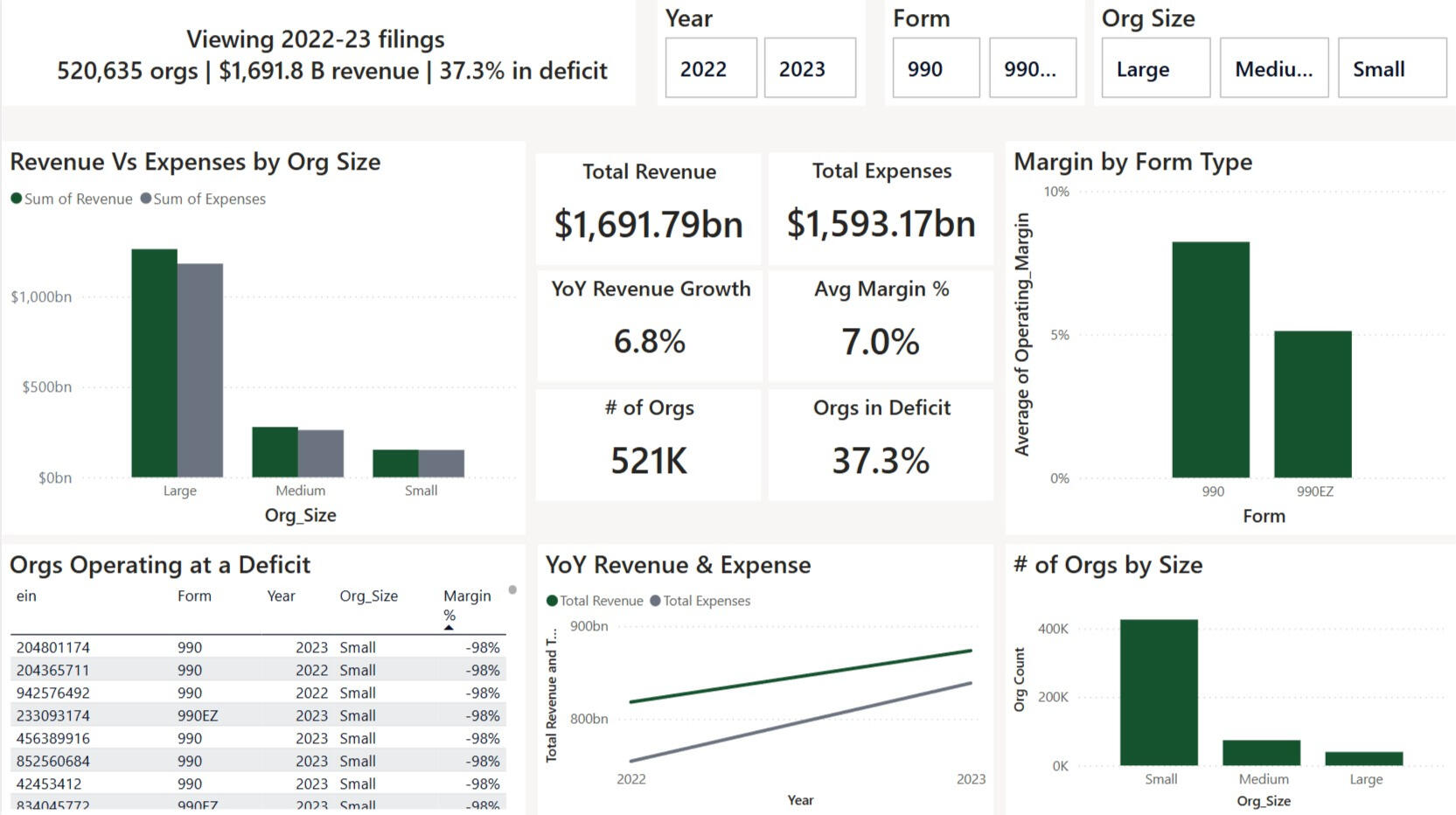
Visualizing U.S. Non-Profit Health (2022-23)
IRS bulk files list every Form 990 and 990-EZ return, but they arrive as enormous spreadsheets. Hundreds of fields, hundreds of thousands of rows, and little context. I distilled them into a one-page Power BI report that shows revenue trends, deficit risk, and outliers in seconds.
Tools & Focus
Tools: Excel + Power Query, DAX, Power BI
Focus: Data cleaning, modeling, storytelling visuals
Challenge
Leaders need a quick read on sector-wide revenue trends and deficit risk but raw IRS data is unwieldy, packed with cryptic field names, and skewed by extreme margins (±500 %).
Approach
Select the signals
| What I did | Why I did it |
|---|---|
| Kept 8 core columns (EIN, Year, Revenue, Expenses, Assets & Net Assets) and derived Surplus & Margin. | Strip noise so every field feeds a visual. |
Union the files
| What I did | Why I did it |
|---|---|
| SELECTCOLUMNS → UNION in DAX to merge the four source sheets into one tidy table. | One table = straightforward relationships, measures in a single place, and no manual copy-paste. |
Tame outliers
| What I did | Why I did it |
|---|---|
| Flagged margins outside ±100 % and excluded them from percentile / IQR / z-score rules so visuals stay readable. | Keep charts readable while preserving data integrity for deep dives. |
Create dynamic measures
| What I did | Why I did it |
|---|---|
| Total Revenue, Total Expenses, Operating Surplus, Operating Margin, Org Count, Deficit %, YoY Revenue Growth %, Revenue P99, IQR bounds, Z-score outlier flag. | Each measure answers a stakeholder question—“How big?” “Growing?” “At risk?”—and powers slicers, tooltips, and conditional colours. |
Surface insights
| What I did | Why I did it |
|---|---|
| Built KPI ribbon, Size bar, YoY growth line, Form-type margin bar, Deficit watch-list table, and a narrative card that rewrites itself with slicers. | Deliver a story flow: headline → segment view → trend → risk list → plain-English summary. |
Results
The finished report compresses two full filing years into a single, intuitive view: it surfaces the financial posture of roughly 520K nonprofits. Because every KPI and visual is slicer-aware, a board member can instantly pivot by filing form, size band, or year and watch the entire story update in real time. Grantmakers can spot grantees drifting into deficit before renewal cycles, analysts can compare efficiency between 990 and 990-EZ filers at a glance, and nonprofit CFOs gain a quick benchmark against peers without wading through raw IRS spreadsheets. The dashboard illustrates how disciplined data reduction and clear narrative framing turn an overwhelming public dataset into actionable insight.
Key Skills Shown
Power Query reduction & transformation
DAX for context-aware IQR / Z-score logic
Financial storytelling - only visuals that answer real questions
Outlier handling without hiding data integrity
What I Learned
Data persuades when it’s distilled and narrated. By defining the right measures, taming extremes, and adding a dynamic narrative sentence, I turned an intimidating dataset into an actionable story for decision-makers.